Mobile Engineer
TM
Mobile Engineer
TM
Mobile Engineer
TM


Year
2016-2021
Role
Product designer, Frontend developer
Problem
Laboratory equipment requires periodic maintenance. It can also break down suddenly and stop lab work for hours. This means hundreds, sometimes thousands of tests done late.
The equipment maintenance company has grown rapidly and needed a convenient tool to monitor and perform service repairs quickly.
First research
At the beginning of the project, we interviewed the service manager and the service department staff. They already had experience of working with a similar application, but its functionality was very weak. The previous solution was connected to 1C (the Russian analog of SAP), and it was important for the owner to preserve this connection. It is a very complex solution with modules for accounting, warehouse and sales with linked data.
The main task of the MVP was for the programmer to recreate this type of connection, and for both of us to recreate and build up the functionality of the application in use.
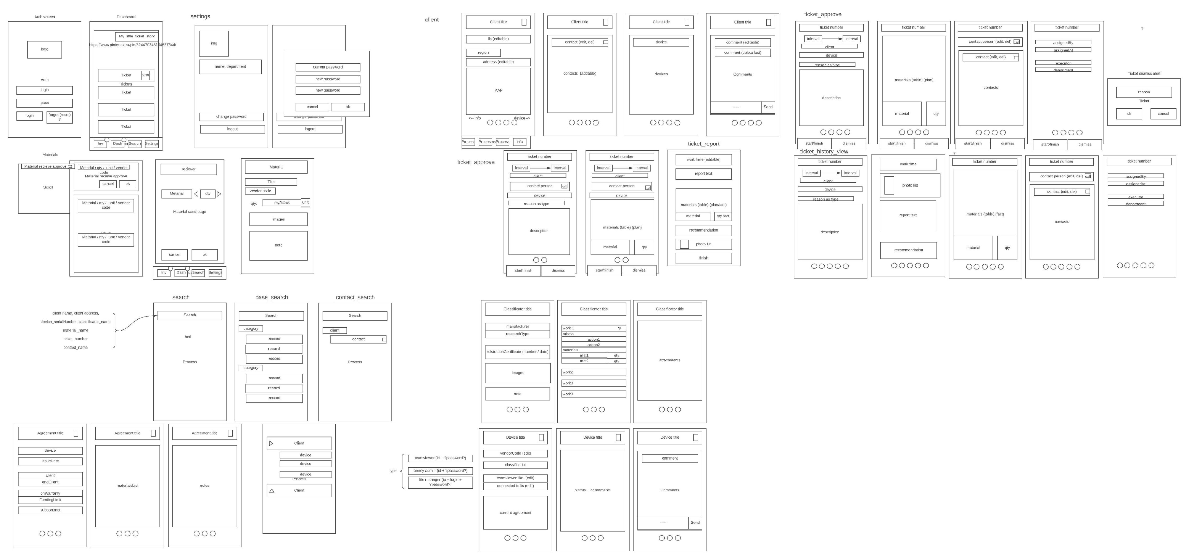
First UX draft
Users and roles
At the stage of research with the service manager, a new role in the service team was declared: a coordinator who should receive emails or calls from customers, formalize them in the form of tasks and send them to the first available engineer. The engineer sees the list of his tasks, selects one or more of them (in case of a breakdown of several devices in one room or on one level) and starts working.
At this point a timer shall be started to calculate the actual work time. When the work is finished, the engineer closes the ticket: writes a couple of words about what was done, takes a few photos and presses the "Close" button. At this moment the timer stops and the coordinator gives a message about it.
First research
At the beginning of the project, we interviewed the service manager and the service department staff. They already had experience of working with a similar application, but its functionality was very weak. The previous solution was connected to 1C (the Russian analog of SAP), and it was important for the owner to preserve this connection. It is a very complex solution with modules for accounting, warehouse and sales with linked data.
The main task of the MVP was for the programmer to recreate this type of connection, and for both of us to recreate and build up the functionality of the application in use.

First UX draft
Users and roles
At the stage of research with the service manager, a new role in the service team was declared: a coordinator who should receive emails or calls from customers, formalize them in the form of tasks and send them to the first available engineer. The engineer sees the list of his tasks, selects one or more of them (in case of a breakdown of several devices in one room or on one level) and starts working.
At this point a timer shall be started to calculate the actual work time. When the work is finished, the engineer closes the ticket: writes a couple of words about what was done, takes a few photos and presses the "Close" button. At this moment the timer stops and the coordinator gives a message about it.
First research
At the beginning of the project, we interviewed the service manager and the service department staff. They already had experience of working with a similar application, but its functionality was very weak. The previous solution was connected to 1C (the Russian analog of SAP), and it was important for the owner to preserve this connection. It is a very complex solution with modules for accounting, warehouse and sales with linked data.
The main task of the MVP was for the programmer to recreate this type of connection, and for both of us to recreate and build up the functionality of the application in use.

First UX draft
Users and roles
At the stage of research with the service manager, a new role in the service team was declared: a coordinator who should receive emails or calls from customers, formalize them in the form of tasks and send them to the first available engineer. The engineer sees the list of his tasks, selects one or more of them (in case of a breakdown of several devices in one room or on one level) and starts working.
At this point a timer shall be started to calculate the actual work time. When the work is finished, the engineer closes the ticket: writes a couple of words about what was done, takes a few photos and presses the "Close" button. At this moment the timer stops and the coordinator gives a message about it.
MVP
On the main screen we have tickets, that are arranged at the bottom for easy access. The top row displays the active tickets.
For the rest of the pages, I chose a horizontally scrolling structure. At the time, it seemed to me that accessing information would be faster with this arrangement. Here we have subpages with basic information, device information, etc
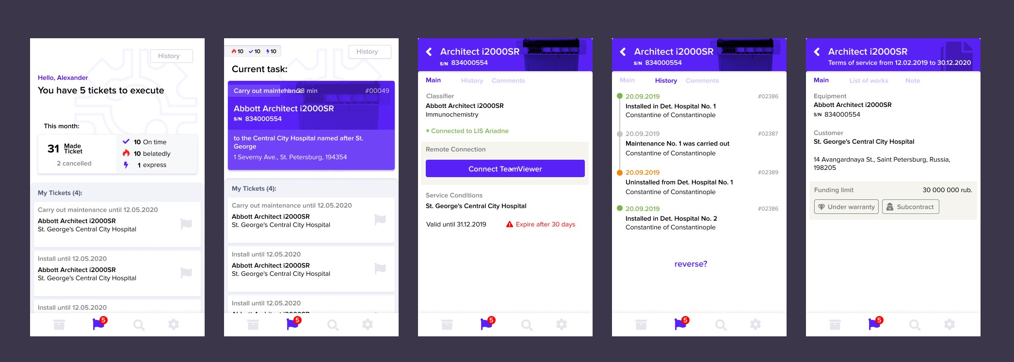
MVP allowed me to understand to understand that:
- Stacking of entities work bad because we have a lot of links
- Bad understanding of what entity is open because all of them look similar by hierarchy.
Additional needs:
• Separate role of coordinator - workflow was changed
• Add a role of an Head of the team who can manage members and watch statistics
• Add a statistics itself
• Ad a material swap feature
• Add the statuses of employees to quickly who is where at the
needed date.
Final solution

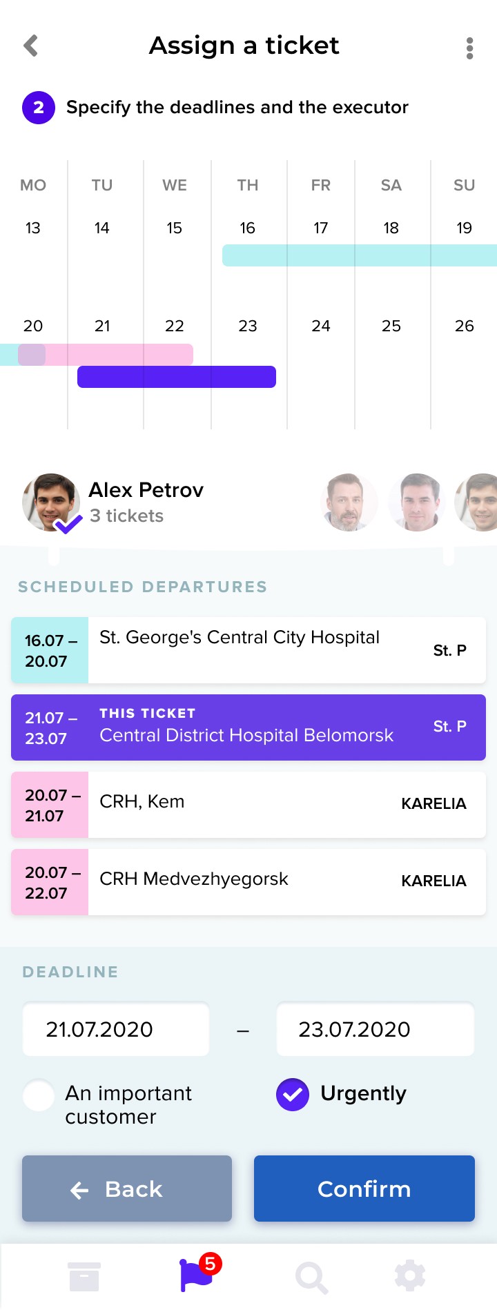

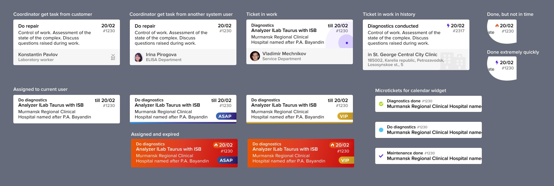
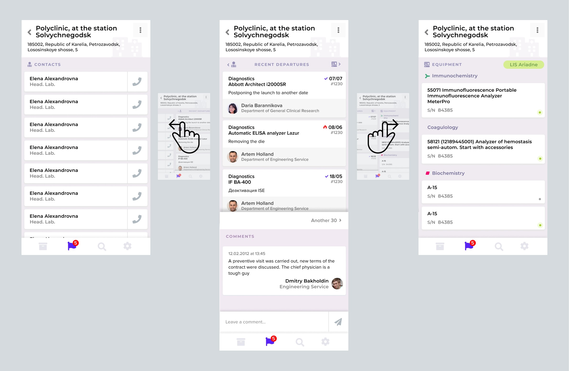

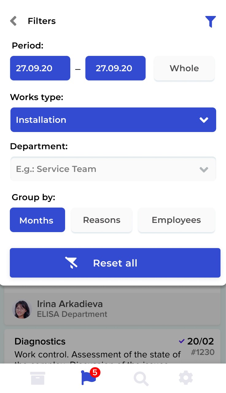
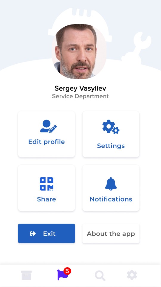
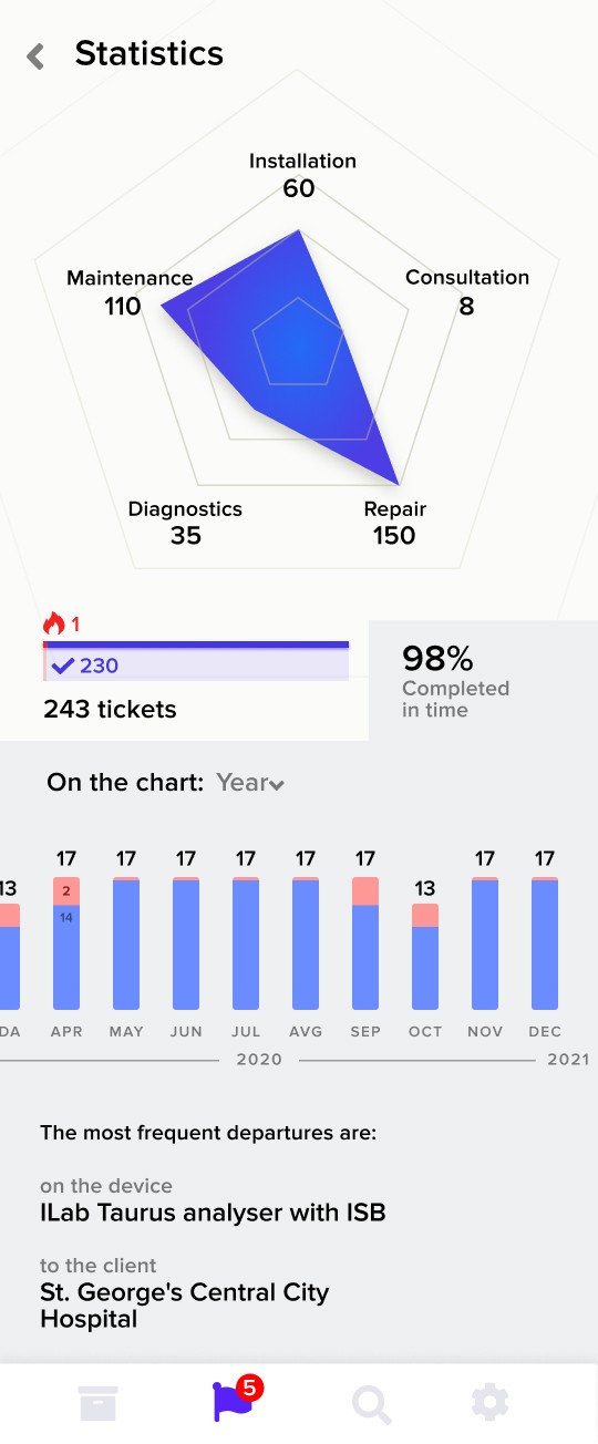
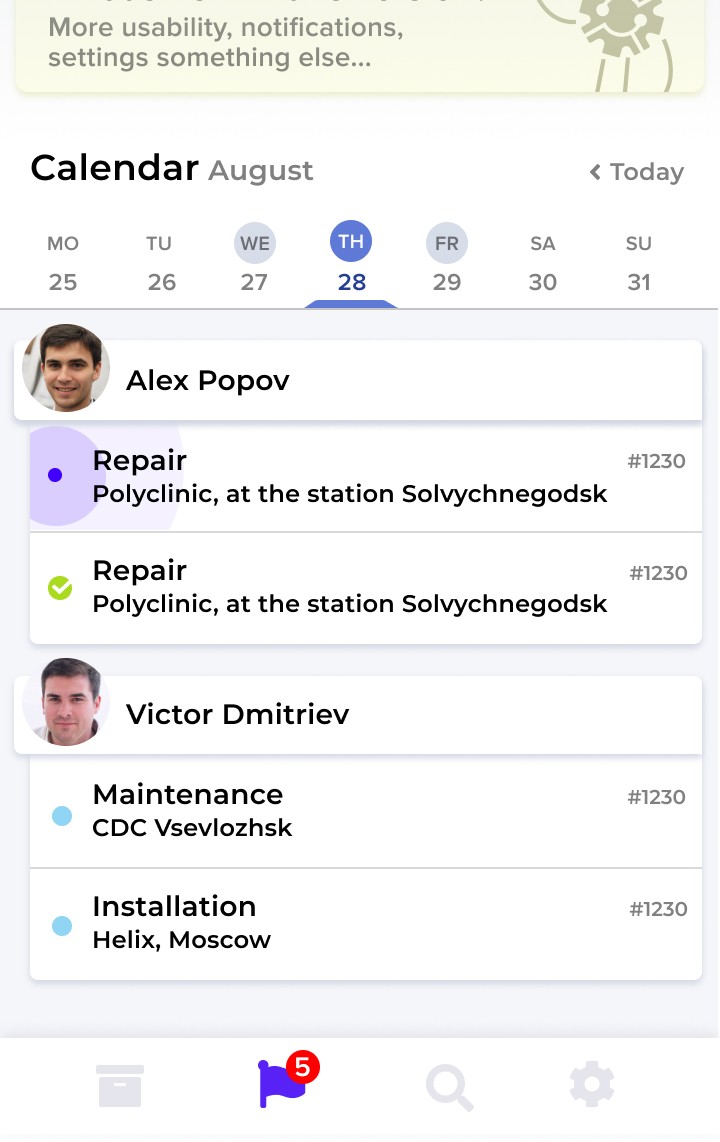
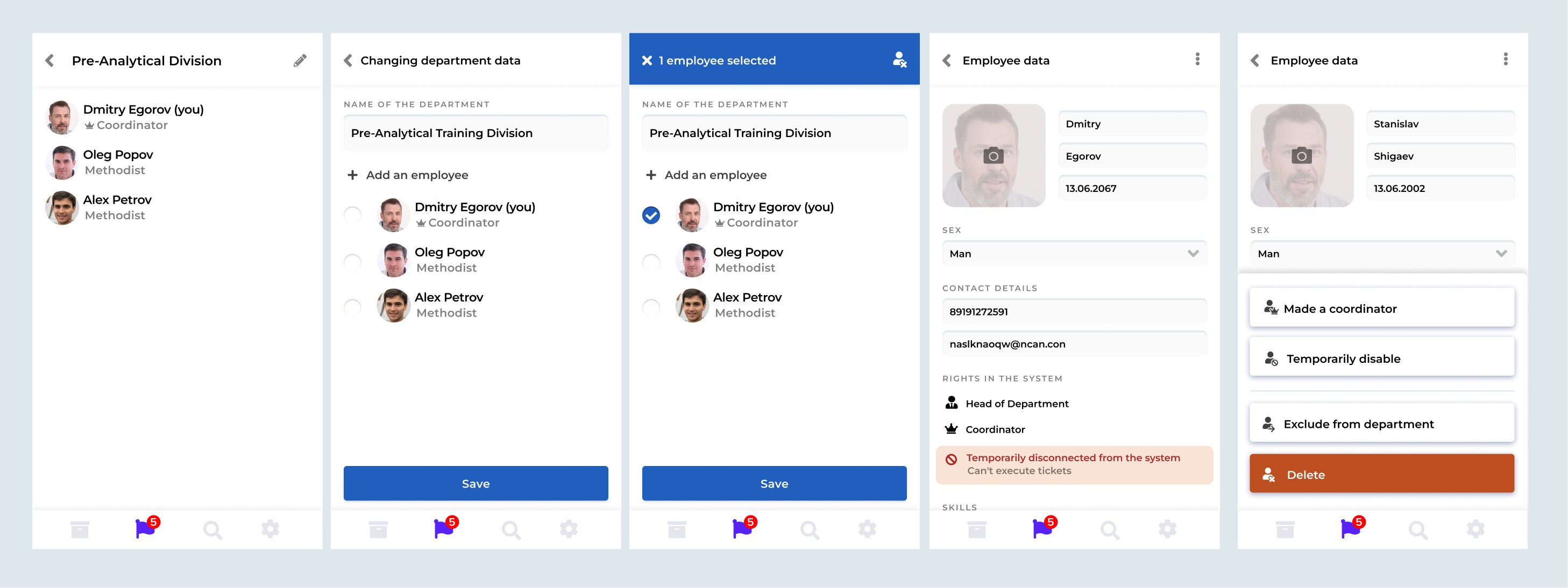
The final solution contains more than 40 screens of different layout and 3 times more functionality than originally planned. MPV had already proved to be a good solution, but the final solution significantly increased the efficiency of the service and was extended to employees of the head office in other cities